
Large-format porcelain has a way of making a space feel calmer. Fewer grout joints, longer sightlines, less visual noise. If you’re chasing that minimalist, gallery-floor vibe, this is the material that gets you there faster than almost anything else.
But it’s also the tile category that punishes sloppy prep. Hard.
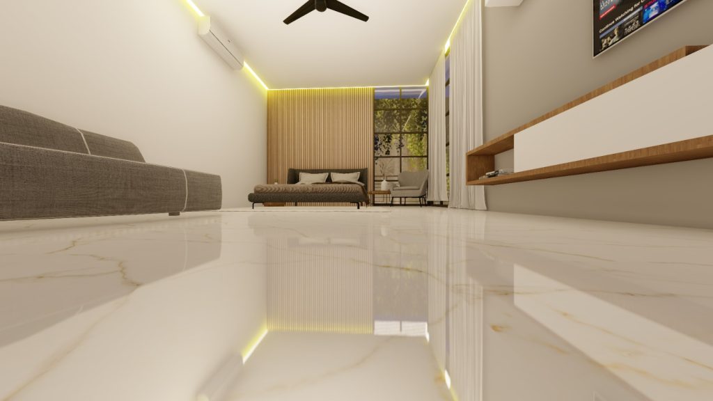
Big tile, big visual payoff
A lot of “modern” interiors are really just interiors with fewer interruptions. Large-format tile does that naturally because you’re not chopping the floor into a grid of grout lines every 12 inches, especially when installed by large format porcelain tile installers.
One line that always sticks with clients: the grout is the pattern. Reduce the grout, and the room quiets down.
And yes, it can make rooms feel larger. Not because the tile is magical, but because your eye has fewer stops. Sightline continuity is a real design tool, especially in open plans where kitchen → dining → living needs to read as one connected field instead of three separate flooring events.
Hot take: if your subfloor isn’t flat, don’t buy the tile yet.
I’ve seen people pick gorgeous 24×48 porcelain and then try to “make it work” over a wavy substrate. That’s where projects go from confident to chaotic.
Large-format tile doesn’t bend. The thinset bed isn’t there to fix a bad floor. It’s there to bond a good one.
One-line reality check.
What large-format porcelain does well (and why people keep choosing it)
Porcelain is dense, stable, and generally harder-wearing than many ceramic options. In plain language: it takes abuse and keeps its face.
Where it really wins:
– Less grout to maintain (also fewer places for discoloration to start)
– High abrasion resistance for busy homes, retail, hospitality
– A cleaner “plane” effect that makes light behave better across the surface
– Design flexibility: stone-look, concrete-look, metal-look, even fabric-look is now legitimately convincing
Now, this won’t apply to everyone, but… if you have kids, dogs, or a steady stream of shoes coming through the door, the practical side matters as much as the aesthetic. Porcelain handles that traffic without acting precious.
Subfloor prep: the unglamorous part that decides everything
Here’s the specialist briefing version.
Large-format tile installations live or die by two things: flatness and coverage.
Flatness targets (don’t guess)
Industry guidance for substrate flatness is commonly referenced from ANSI standards: no more than 1/8″ variation in 10 feet and 1/16″ in 2 feet for large-format tile. Source: ANSI A108.02 (the language gets technical, but that tolerance is the headline).
If you’re outside that range, you’re signing up for lippage, hollow spots, cracked grout, and the kind of callbacks nobody wants.
What I check before a single tile comes out of the box
Moisture, movement, and plane. In that order.
– Moisture testing appropriate to the substrate (RH probes for slabs if you’re doing it properly)
– Deflection/rigidity (wood subfloors don’t get a free pass)
– High spots ground down, low spots filled with a compatible patch/SLU system
– Transitions and edge support planned, not improvised at the end (that’s where chips happen)
Look, prep isn’t sexy. But prep is the job.
Size and finish: don’t pick with your eyes only
Tile size should match the building, not just the Pinterest photo.
A 24×48 can look incredible in a medium room, but it also means:
– fewer layout “escape routes” if the walls aren’t square
– heavier pieces that stress handling and setting time
– cuts that require real saw capacity (and clean technique)
Finish is where people get surprised. Polished porcelain photographs like a dream. It also shows dust, smudges, and raking light more than most homeowners expect (especially with big windows). Matte or “silk” finishes are usually the sweet spot: easier living, still refined.
Color choice? I’m opinionated here: mid-tones outperform extremes. Super white shows everything. Near-black shows everything else. Soft greiges, warm stones, concrete midtones, those are the colors that age well and don’t make you a prisoner to maintenance.
Installation best practices (the part where pros separate themselves)
Some of this is craft, some is process control.
If you want large-format to look expensive, you need:
– a layout grid you actually follow
– consistent trowel selection and directional troweling
– back-buttering when required to hit coverage targets
– a leveling system used intelligently (not as a crutch for bad prep)
– clean joints as you go (dried thinset in joints is the silent schedule killer)
Adhesive choice matters more than people think. Open time, non-sag performance for walls, deformability for movement, those aren’t marketing words, they’re jobsite outcomes. And movement joints aren’t optional just because the tile is “big and strong.” The building moves. The tile doesn’t want to.
Maintenance: keep it simple, stay consistent
Porcelain is low drama if you treat it like porcelain.
Daily grit is the enemy because it acts like sandpaper underfoot. So the routine that works (in real houses, not just spec sheets) is:
– dry dust mop as needed
– damp mop weekly with a neutral pH cleaner
– avoid acids and harsh degreasers unless the manufacturer explicitly allows it
– grout haze? handle it early, gently, and with the right product (don’t go rogue with vinegar)
And yes, entry mats and felt pads are boring. They also work.
Cost: the tile isn’t the expensive part (usually)
People fixate on price-per-square-foot of the tile. That’s understandable, but it’s not the real number.
Large-format projects often cost more because of:
– substrate flattening and prep materials
– labor pace (handling, coverage, layout discipline)
– tool requirements (saws, blades, leveling systems)
– breakage risk in transport and staging
The long-term value tends to show up in reduced grout maintenance, fewer replacements, and better wear in high-traffic zones. If the installation is done right, the floor stays “quiet” for years. If it’s done wrong, you’ll be staring at lippage in every sunset shadow.
A quick look ahead: tech-forward surfaces and mixed material thinking
More projects are blending large-format porcelain with other materials, wood thresholds, microcement walls, metal trims, because the tile acts like a stable, neutral anchor. Also, manufacturers keep pushing functional coatings (anti-microbial, ultra-matte, stain-resistant). Some of it is genuinely useful, some of it is branding (you’ll know which after a year of cleaning).
I’m more interested in the practical “future trend,” honestly: better systems. Smarter underlayments, clearer moisture mitigation protocols, and crews treating tolerances like non-negotiables. That’s the stuff that actually changes outcomes.
Large-format tile isn’t a shortcut to modern.
It’s a commitment to precision.